Design System for an AI-enabled Analytics Platform
Executive Summary
The analytics group I previously worked with needed a scalable, reusable design system to support a growing internal platform. They had hired new designers but lacked a unified foundation in Figma. I was brought in as a freelance UX designer to create a comprehensive, production-ready design system tailored to their data-heavy workflows. Starting with the Material Design base, I built and documented nearly 100 components optimized for analytics use cases, including AI-enhanced feedback, metrics displays, color-blind friendly charts, and responsive layouts. This system accelerated handoffs, reduced visual inconsistencies, and helped new designers onboard quickly.
Introduction & Context
As the analytics platform grew, the need for consistency, speed, and accessibility became more urgent. I joined the team as the design system lead, responsible for creating a scalable Figma library and set of standards that would support both product designers and front-end engineers. The goal was not just visual alignment but a practical toolkit for real-world analytics challenges, including support for AI-driven features and ongoing accessibility improvements.
Background
The internal analytics platform supported multiple departments across the organization. Over time, the team had grown organically, with different designers and developers creating components as needed. As new designers joined, the lack of a shared system slowed down projects, led to inconsistent interfaces, and created confusion during reviews.
To solve this, the team asked me to return as a designer and take the lead on building a unified design system in Figma. They needed more than a UI kit. They wanted a system that could scale, enforce accessibility standards, and reflect their analytics-focused use cases. The system also had to support new AI-enabled features that required consistent interaction patterns and adaptive feedback elements.
Before the redesign, there were over a dozen button styles and multiple chart layouts in use. Hand-off from design to engineering was inconsistent, and documentation was limited or outdated. New features required recreating common UI patterns from scratch. My first step was a comprehensive audit, reviewing every component in use, gathering pain points from the team, and mapping the most urgent opportunities for improvement.
My Role
As the lead designer, I created the entire design system in Figma, starting with the Material 3 foundation and expanding it to fit the platform’s real needs. I designed nearly 100 components that included foundational elements like buttons and form fields, as well as complex data cards, filtering panels, charts, and AI feedback modules. I worked closely with developers and new designers to ensure the system was clear, reusable, and accessible.
I facilitated working sessions with developers and quality assessment to identify where accessibility could be improved at the code level, not just in Figma. For each major component, I documented expected keyboard behaviors and contrast requirements. This collaborative approach made the system more robust and ensured shared ownership of accessibility and usability across the team.
Design Process
I began with core elements like buttons and layout structures, then expanded the system into modular interface patterns that matched the platform’s use cases. I used Figma’s component properties and variables to manage complexity and allow flexible theming. Each component was built to support real features such as AI-generated responses, metric visualizations, and configurable filters.
Beyond building components, I created a living documentation hub with usage examples, do’s and don’ts, and practical guidelines for complex analytics workflows. I also set up a feedback loop so anyone on the team could propose changes or additions, supporting continuous improvement after handoff.
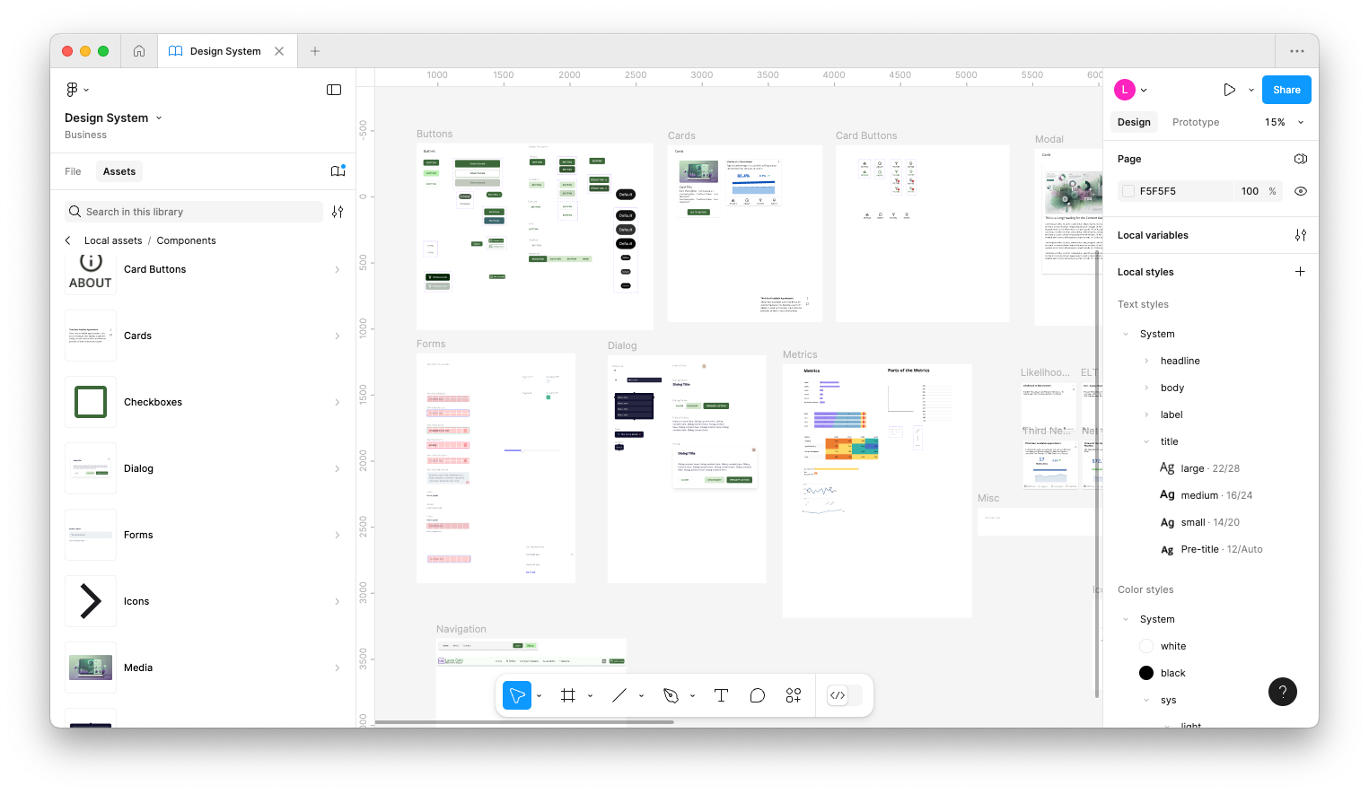
Buttons
I created a full set of button components that allowed designers to configure actions across different layouts and themes. Each button supported hover states, icon placements, and toggled content visibility using Figma variables.
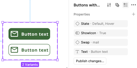
Cards
I designed two core card types. The media card supports imagery, short text, and actions—ideal for content surfaces. The metric summary card was tailored for analytics, summarizing performance indicators in a visually digestible layout.
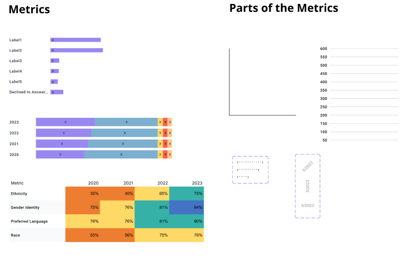
Metrics and Charts
The analytics platform required a comprehensive set of chart and metric components. I created detailed tables, stacked bar charts, line charts, and compact summary modules called mini metrics. These allowed users to scan performance quickly or explore deep insights.
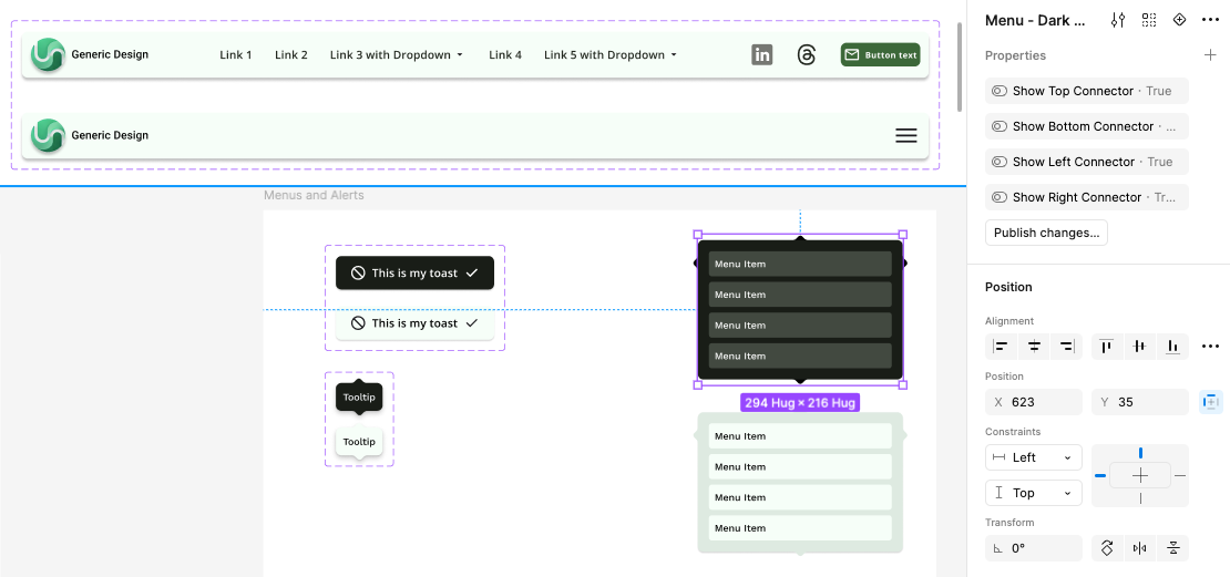
Navigation and Menus
To support the platform’s complex structure, I designed responsive navigation bars, dropdown menus, and overlay components. Each menu was configured for both light and dark modes and included flexible connector options for dynamic positioning.
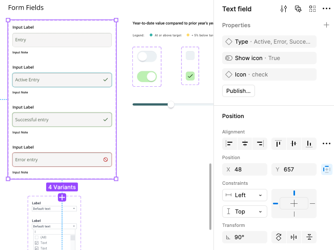
Form Elements
Form elements were built for high accessibility and feedback clarity. Each component supported validation states like error and success, icon usage, and contextual help. These were tested to ensure readability and clarity during data entry workflows.
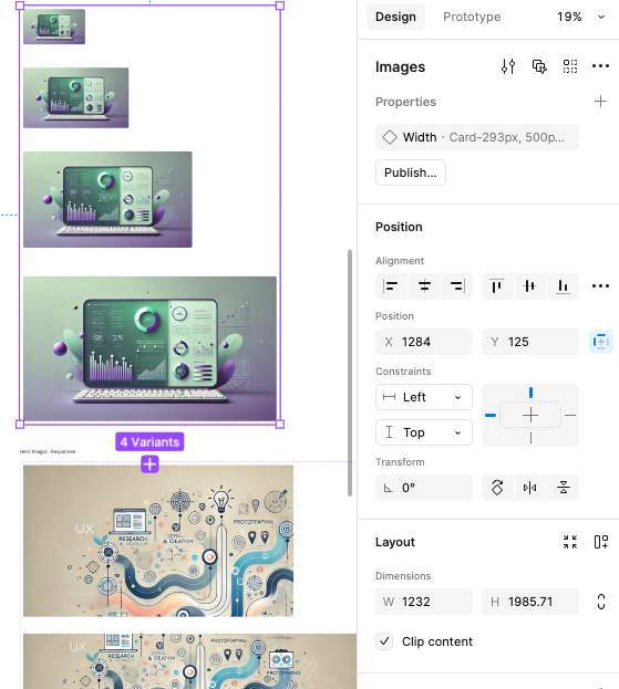
Media Elements
I created responsive components for displaying imagery across screen sizes. These were used in hero layouts, thumbnails, and visual cards, and they maintained aspect ratios and loading clarity across mobile and desktop views.
Each component included proper states, accessibility support, and theming flexibility. I also created documentation and examples so the team could apply, reuse, and extend components easily across projects.
Outcome and Impact
The system was adopted across the team’s active analytics projects. New designers were able to prototype and hand off screens faster, with a consistent foundation. Developers found the structure easy to work with, especially for high-complexity areas like AI feedback and responsive filtering.
After launch, onboarding for new designers was reduced from weeks to days, and developers were able to implement new analytics features more quickly and with fewer errors. Design cycles were shorter because everyone worked from the same toolkit and rules. Team members told me the design system gave them confidence to focus on the product instead of pixel-policing screens.
Feedback from the team highlighted faster onboarding, easier collaboration, and clearer visual language across their platform. The use of variables, templates, and documented components reduced decision fatigue and improved design quality. Although my role ended after handoff, the system continued to support consistent and efficient design well beyond the project timeline.
This system continues to power rapid prototyping, designer onboarding, and consistent user experience across a growing analytics platform.
Reflection
Creating and delivering this design system was a delight to see implemented and used. It was rewarding to see the system continue to grow, with new contributors and components added after my engagement ended. The success came from deep collaboration, focus on real user and developer needs, and never losing sight of accessibility as a foundation for every decision.