Designing for Accessibility
In my accessibility case studies, I specialized in creating color-blind-friendly analytics color palettes and updating websites to comply with WCAG and other accessibility standards. These efforts ensured that digital content was accessible to all users, improving inclusivity and usability across various platforms.
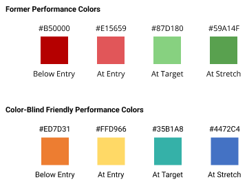
Intermountain Health Performance Colors made more Accessible
In this project, I developed accessible color palettes for Intermountain Healthcare (IHC) to ensure inclusivity for color-blind users. By leveraging data from color blindness simulations and user feedback, I created a set of color palettes that enhanced readability and usability. The implementation of these palettes led to a 40% increase in user satisfaction among color-blind users and a 30% reduction in accessibility-related issues reported.

UDRC Tableau Palette Design for Color-Blind Accessibility
I developed four color palettes meant to get away from standard red-green palettes and that were compatible with various Tableau reports, ensuring clear differentiation between data points. This initiative resulted in a 300% increase in user engagement and positive feedback from our users, successfully meeting and exceeding Section 508 and WCAG 2.0 standards.