Transforming Healthcare with AI-Driven Insights: A UX/UI Design Case Study for Intermountain Health
Background
Intermountain Health had developed an internal analytics platform used by clinical and executive teams to monitor patient outcomes, department performance, and operational trends. As part of an effort to make data more actionable, the analytics group integrated machine learning models that automatically generated insights based on recent patterns. These insights were displayed on dashboards and intended to support faster decision-making.
However, early versions of the insights were difficult to understand. These early versions relied on technical language directly derived from the models, often lacking clarity and context.
Users reported skipping over these sections or misinterpreting the insights. Some insights were helpful, but others were too vague, too detailed, or misaligned with how clinicians and administrators processed information in high-pressure settings.
The analytics team recognized the need to enhance the presentation of AI-generated insights. They asked me to lead a redesign effort to make insights clearer, more human-readable, and more usable in daily workflows.
My Role
As the UX lead on this project, I was responsible for redesigning the presentation of AI-generated insights across the analytics platform. I partnered with data analysts, product managers, and clinicians to translate machine-generated outputs into clear, actionable summaries that supported real-time decision-making.
My role included reviewing existing insight structures, leading design strategy, writing and testing new insight patterns, and collaborating with developers to ensure the new model could be integrated with live data. I also worked closely with stakeholders to validate usability improvements and ensure the insights aligned with clinical and administrative workflows.
Research and Insights
To inform the redesign, I began by studying dozens of machine-generated summaries produced by internal data science models. These insights were based on trends in patient outcomes, staffing performance, and operational workflows. While technically sound, they were often dense, inconsistent, or disconnected from the dashboard visuals.
I conducted interviews and usability testing with clinical leaders, analysts, and hospital administrators to learn how they interpreted the insights and what they found frustrating. Many users ignored the insights entirely or misunderstood them. Some lacked context, others required verification, and a few introduced uncertainty instead of clarity.
A clear pattern emerged. Users sought concise, trustworthy summaries that highlighted fundamental changes and explained their significance. They preferred a headline-and-detail structure that used plain language, an active tone, and a strong visual connection to the metric being referenced. Insights are needed to make a callout, not a wall of text.
This research provided a clear direction for rewriting the summaries, rethinking the layout, and designing an interaction model that made insights worthwhile without overwhelming users.
Design Process
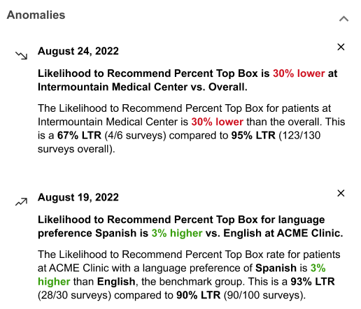
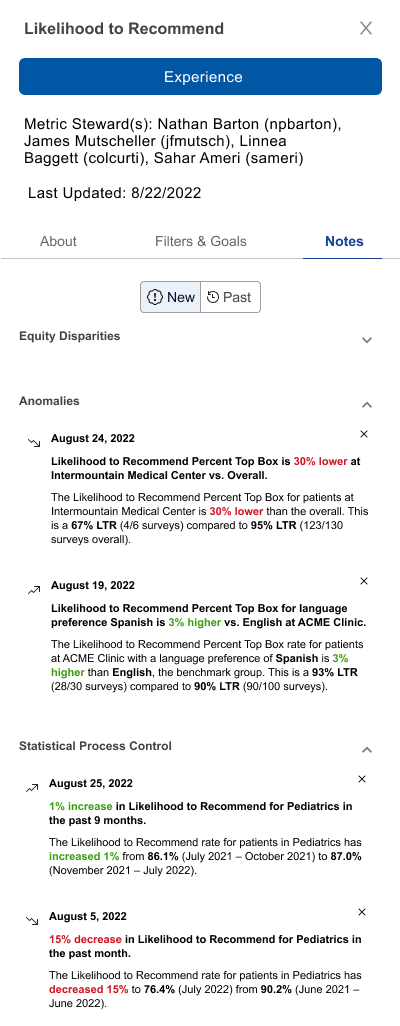
The original approach surfaced AI-generated summaries in a drawer labeled “Alerts.” These alerts were triggered when the system detected significant changes in metrics related to equity, operations, or performance. The drawer could be opened from a button in the dashboard interface, and summaries were presented in a linear list. While the design was functional, early feedback showed that both the interaction model and the content needed refinement.
Users immediately pointed out that the term “Alerts” felt too urgent for information that was often routine or contextual. Many associated “Alerts” with high-priority emergencies and worried it could lead to alarm fatigue. This early feedback prompted us to test alternative labels with users. The consensus was clear: “Notes” felt more accurate and approachable. Adopting “Notes” signaled to users that these updates were informative, not urgent.
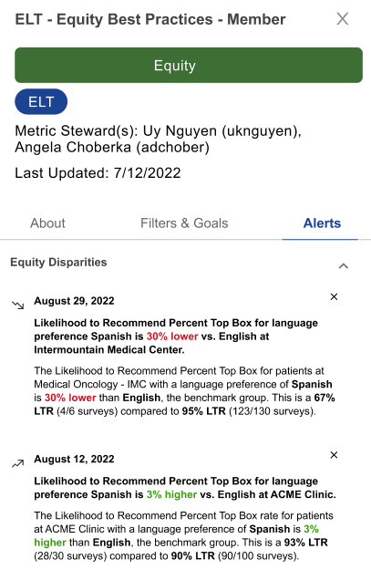
In addition to the label, users told us they only wanted to see a note or alert when something truly required their attention. They did not want the interface cluttered with AI-generated summaries for every metric, especially if nothing meaningful had changed. This input directly shaped our design logic: the insight module would only display notes when a metric crossed a threshold for urgency or significance. This reduced interruptions and reinforced user trust.
Another important insight came from testing how users interacted with the summaries. Most preferred to see a visible, concise note directly on the metric card—something that would quickly signal when a change had occurred, without needing to open a drawer. The drawer then became a secondary space for exploring additional context only when needed.
Next Iteration of Designs
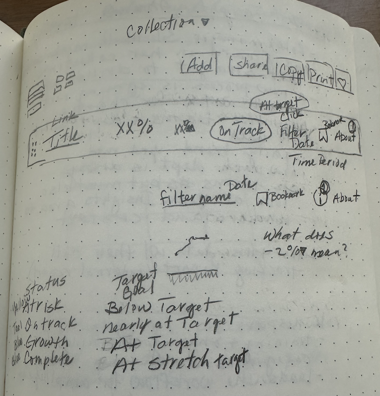
Visual hierarchy and tone were further refined with repeated feedback from stakeholders. We replaced the original alert icon with a more subtle visual marker and paired it with the new “Notes” label. Adjustments to color and typography improved scannability and reduced unnecessary urgency.
Separate rounds of usability testing focused on the content of the summaries themselves. Reviewing dozens of real AI-generated outputs, we learned that original insights were often technically correct but written in dense, jargon-heavy paragraphs. They lacked clear visual ties to the relevant metric and were hard to scan for quick meaning.
To address this, I rewrote actual summaries using a structure that was easier to trust and understand. Each summary began with a short, bolded headline describing the most important change, followed by a plain-language explanation with familiar clinical or operational terms. This made it much easier for users to quickly grasp what had changed and why it mattered—no need to decipher a paragraph of technical language.
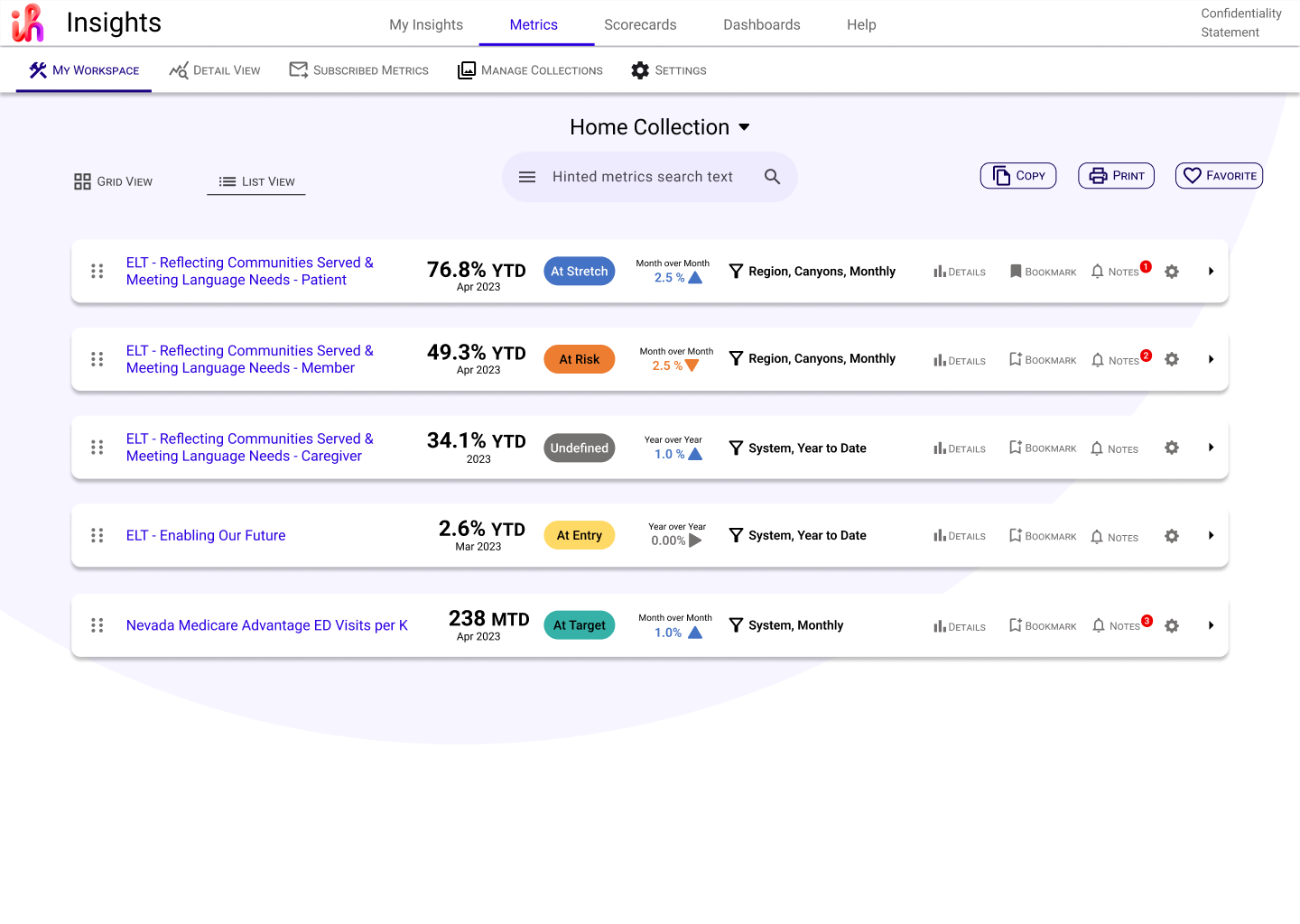
The final design of the metric cards on the main platform page prioritized both clarity and actionability. Each card surfaces the most important metric details—performance status, trends, and time frames—using color-coded labels and consistent layout to make scanning easy for busy users. Key indicators such as “At Stretch,” “At Risk,” and “At Target” use both text and color to quickly communicate status.
Micro-interactions like hover effects and expandable sections provide immediate access to more detail without overwhelming the user at first glance. Users can click on “Details,” “Bookmark,” or “Notes” directly from the card to dig deeper or customize their experience. Notification badges on the Notes icon call attention to new or important updates, but avoid visual clutter by only appearing when relevant.
Every card is generated dynamically from real-time model output, so as the underlying machine learning improved, the presentation could adapt without disrupting the overall user experience. This approach balanced technical power with usability, supporting both high-level monitoring and deeper investigation as needed.
Outcome and Impact
The redesigned insight modules were implemented across the analytics platform and adopted by clinical and executive users. Following the launch, feedback indicated that the new summaries were significantly easier to understand and more trustworthy.
Users began referencing insights during meetings and using them to guide follow-up questions or deeper analysis. Platform analytics showed a 20% increase in insight interaction. Users spent more time hovering, expanding, and following up on summaries.
The clear tone and structured layout helped clinical teams adopt a shared understanding of trends and changes. This redesign became the foundation for future AI-driven summaries across the platform and demonstrated that even complex content can be made usable through thoughtful design.