Designing an AI-Powered Onboarding Experience for SimpliBake
Background
SimpliBake is a startup app designed to help young adults discover recipes using artificial intelligence. The app recommends recipes based on a combination of the user's current query, previous searches, and trending recipes from similar users. The goal was to make recipe exploration feel personal and engaging from the first interaction.
The product team wanted to create a seamless onboarding experience that used AI to personalize results without requiring users to manually configure preferences. They asked me to design a login and onboarding process that felt effortless and intelligent while encouraging exploration of personalized recipe suggestions.
My Role
I was the UX lead and primary designer for this freelance project. I collaborated closely with the founding team and developers to shape the initial experience. I also conducted one round of usability testing and interviews with six millennials to validate the design direction and identify areas for improvement.
Research and Insights
I conducted a round of interviews and usability tests with six users aged 25 to 35. I wanted to understand their expectations for recipe apps, onboarding, and personalization. The participants were all comfortable with mobile-first platforms and used Google or Apple to log in whenever available.
Important to early designs, users indicated that they expected signing in should be easy and immediately unlock useful content without extra steps.
Participants consistently said they wanted to search recipes right away and disliked being asked to answer questions about diet or preferences before using the app. They expected the app to learn from their behavior instead of asking for setup. Some noted that they liked it when apps “just started working” and felt smart without requiring effort.
This feedback validated our plan to use AI and engagement tracking for onboarding. The system would personalize recommendations based on how users searched, which recipes they viewed, and what they clicked. We also confirmed that the onboarding needed to feel invisible. It should support a sense of progress without asking the user to configure anything manually.
Design Process
Early versions of the designs for a login screen were cluttered and included multiple steps.
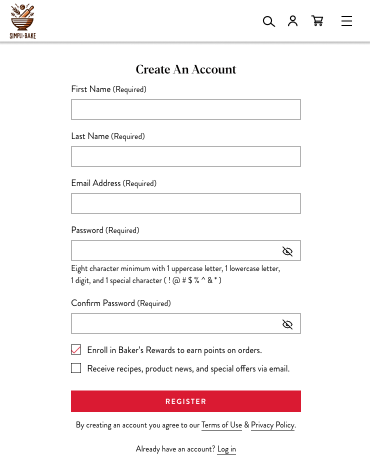
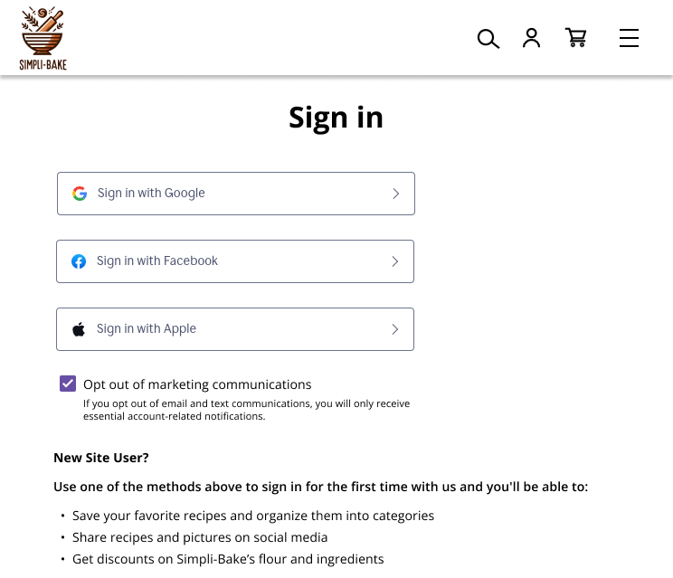
After testing several options with users, I redesigned the login to use just three sign-in buttons: Google, Apple, or email. This simplified approach met user expectations and reduced friction in starting the app.
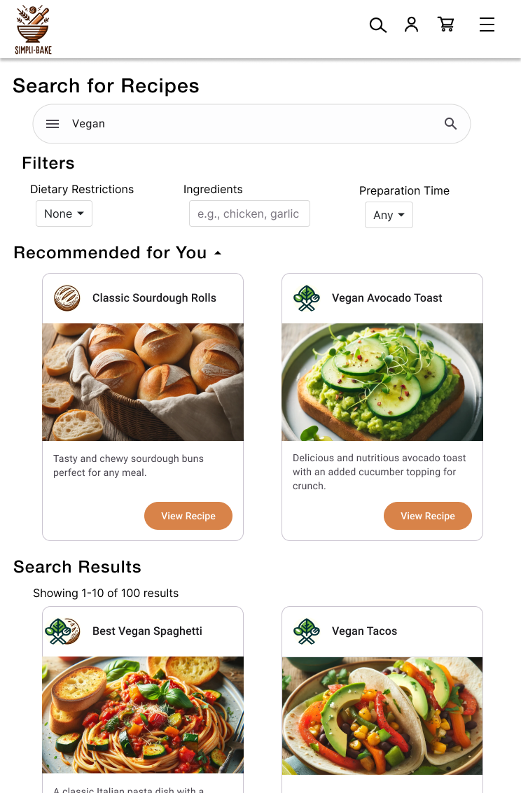
The resulting home screen displayed trending and recommended recipes tied to recent interactions. The AI-powered search screen allowed users to enter terms like “vegan dinner” or “easy pasta” and immediately receive tailored results. The design used cards to show images, titles, ingredient counts, and prep times. AI suggestions appeared at the top, combining past searches with current trends.
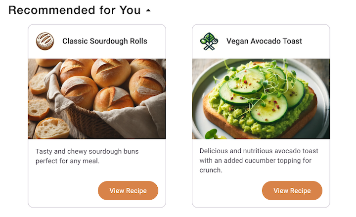
I refined the layout and interaction model over several iterations and rounds of feedback. Filters allowed users to sort results by diet, prep time, and ingredients. Card design emphasized readability and quick decisions. The system also flagged recipes based on matches to similar user profiles, enhancing discovery.
Outcome and Impact
This redesigned onboarding and search experience reduced login-related user drop-off by 50% and increased recipe engagement by 60% in usability testing. Users reported that the app felt fast, smart, and easy to use—qualities that matched their expectations for digital tools.
Participants appreciated that the app “just worked” and gave them recipes that felt relevant without asking for setup. This reinforced the importance of AI that is visible in outcomes but invisible in operation. By focusing on clean UX and real-time learning, the team created a product experience that aligned with how people want to use discovery tools today.