Utah Data Research Center Website Redesign
This project was comprised of a complete overhaul of a government website to clarify its purpose, meet accessibility standards, and help people find data-driven research that matters.
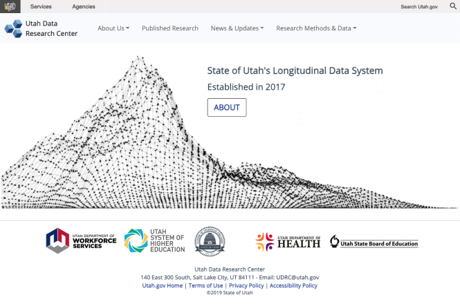
This is what users saw when they first visited the site. There was no clear direction or explanation of what the Utah Data Research Center did or why it mattered.
Research Insights
Usability testing revealed that most users had no idea what the Utah Data Research Center was or why the website existed. Many could not get past the home page. The language was dense, the layout lacked structure, and there were no clear calls to action.
To understand the problem, I conducted usability tests, stakeholder interviews with state department leadership, and a competitive review of government research sites. I also audited existing content paths and tracked where people dropped off.
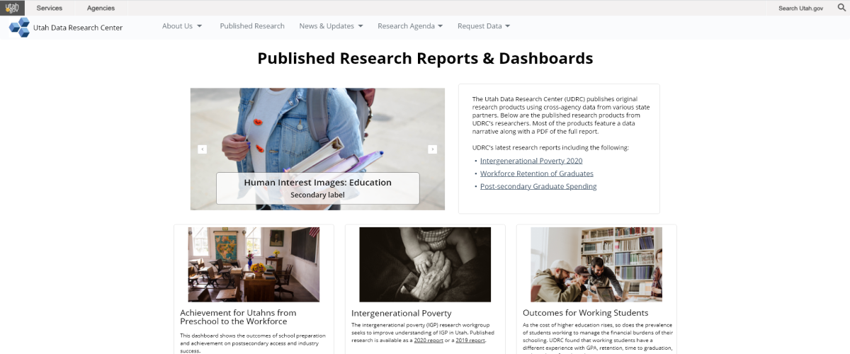
Many users visited for research reports or blog posts but could not find them. These were buried in menus and inconsistently labeled. People needed clearer paths and explanations of why the content mattered.
Accessibility was also a key goal for this government site. I ensured the new design supported keyboard-only navigation and passed internal accessibility reviews.
Initial Design Concepts
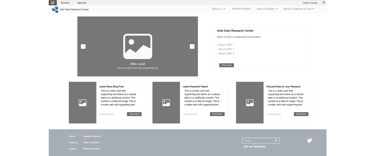
At the request of stakeholders, I began with wireframes rather than high-fidelity visuals. These early designs helped guide conversations about layout, content hierarchy, and user needs.
I started with low-fidelity wireframes to help stakeholders review layout and messaging. This version introduced clearer headings and purpose-driven content.
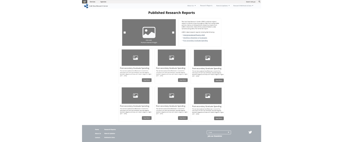
Early wireframes for the reports page focused on organizing content with simple summaries and clearer links to help people find the data they cared about.
Final Designs
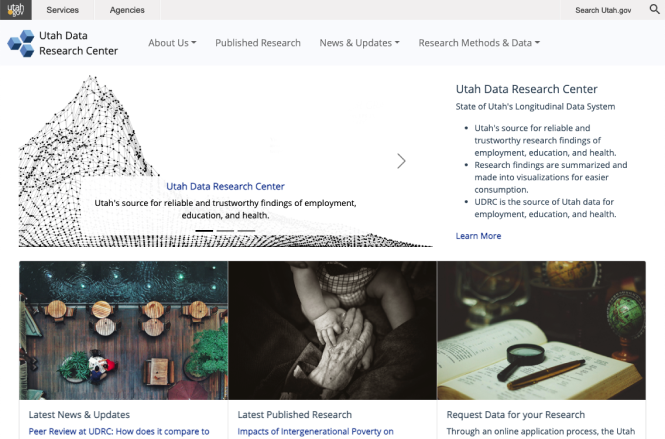
Once the wireframes were approved, I created final designs in Figma with a focus on accessibility, clarity, and clean visual hierarchy. The homepage introduced the UDRC clearly and provided direct access to data tools, research, and blog content. I presented the updated design to state leadership and refined it based on feedback.
After feedback and approvals, the final design offered clear entry points, concise messaging, and accessible navigation across all screen sizes.
The reports page design uses visual consistency and plain language to make it easier for readers to scan and understand complex research.
Blog articles were a key way to explain research to general audiences. I simplified layout and typography so the content could shine.
Outcome and Impact
The new UDRC website launched with improved navigation, accessibility, and content clarity. State leaders noted that the site finally reflected the quality of the research being done. Users could now understand what the UDRC was, find the content they needed, and engage with the material confidently.
Keyboard-only users were able to navigate all interactive components, and the site passed internal accessibility reviews. The design also laid the foundation for future content expansion while keeping the user experience consistent and clear.