Redesigning an Unusable Analytics Platform into a Scalable System for Hospital-Wide Decision-Making
Over the course of a year, I led the complete redesign of an internal analytics platform that had become almost impossible to use. The interface showed metrics in a confusing format with little to no context. Links to additional information were hidden behind subtle hover interactions, so users did not even know they could click for more. The homepage lacked clear entry points, and there was no way to browse the thousands of Tableau dashboards available.
Although the platform technically included critical clinical and operational data, users had no way to find or trust it. Physicians, administrators, and executives created their own workarounds, using long lists of browser bookmarks or circulating Tableau links by email. These behaviors revealed that the platform was not meeting the needs of the organization.
Even more concerning, the platform could only support about ten percent of the total metrics created by the analytics team over the previous decade. These metrics were vital to improving patient care and managing hospital operations, yet most were invisible to users.
To address this, I led a full-scale redesign focused on usability, scalability, and trust. I worked closely with engineers, analysts, and the product manager to restructure the information architecture, redesign the interface, and develop new ways to present data that were clear, actionable, and easy to navigate. After launch, recurring usage increased by 450 percent, and user error dropped by 50 percent. The platform became a daily tool for decision-making across the system.
My Role
I served as the lead UX researcher and designer for this project. I partnered with the analytics product manager, engineering teams, Tableau developers, and stakeholders across clinical and operational roles. I conducted research, prototyped and tested early designs, and delivered high-fidelity UI that addressed the underlying problems users were facing.
- Led stakeholder and user interviews to understand pain points and workflows
- Conducted usability testing with clinicians, executives, and analysts
- Created an expanded site architecture to support thousands of metrics
- Designed new page templates and navigation patterns
- Prototyped features like card and list views, scorecard layouts, and bookmarking
- Presented design updates to executives and incorporated feedback into the final build
Problems We Had to Solve
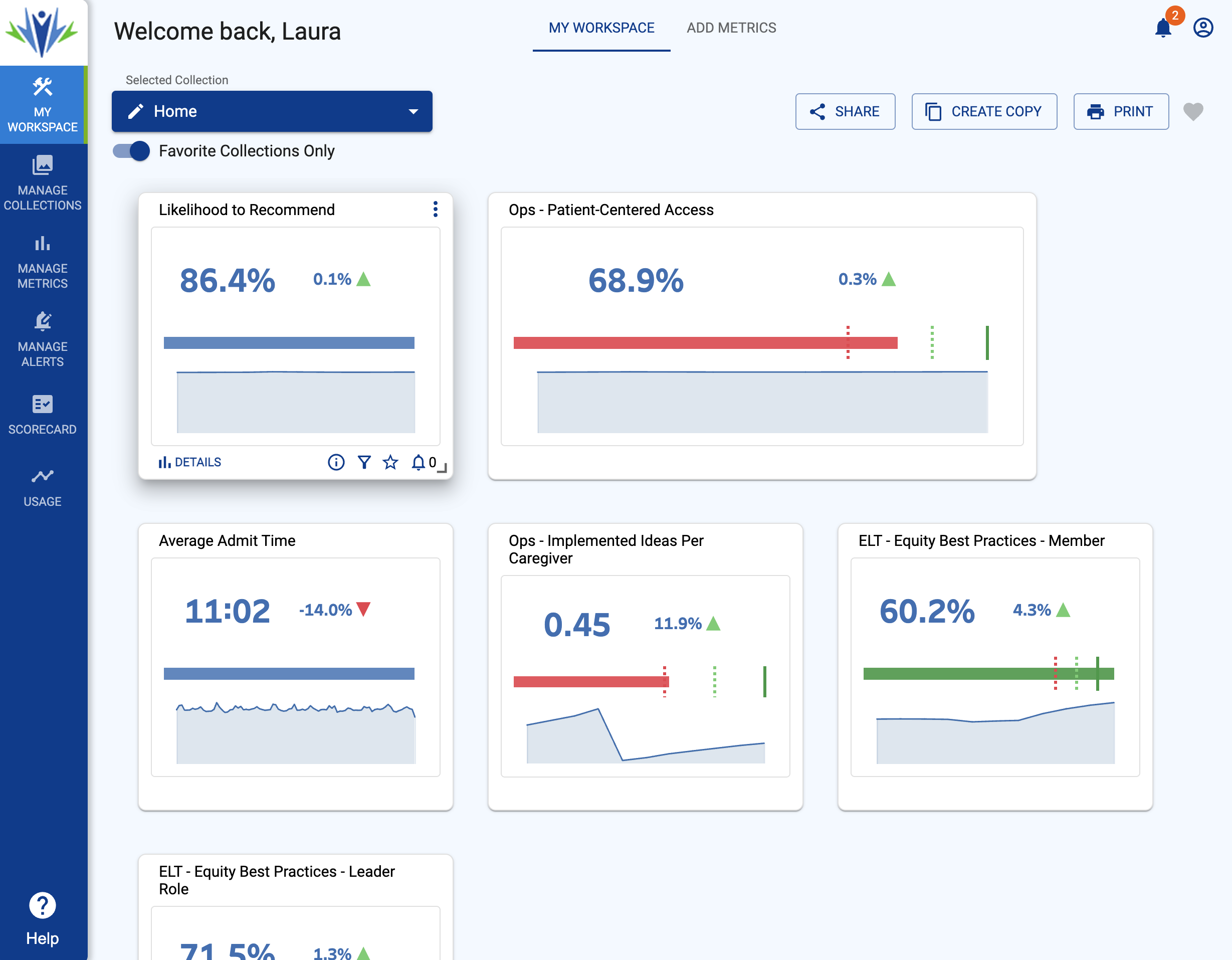
- The site was visually confusing. Metric summaries lacked clarity, and users could not tell what they were looking at or how to get more information
- Navigation was unclear. There was no homepage hierarchy, no filters, and no consistent labels to help people explore or understand what was available
- Important actions were hidden. Links to detailed views only appeared on hover, and most users never discovered them
- The platform could only support a small fraction of the existing dashboards. More than 90 percent of the analytics content created by the organization was inaccessible through the site
- Users bypassed the platform. They relied on email links, spreadsheets, and browser bookmarks to find Tableau dashboards, cutting off the possibility of reuse or discovery
- There was no personalization. Users could not save what they needed or return to the same set of dashboards with ease
Research Insights
To understand how users accessed data and what they expected from the platform, I conducted interviews with physicians, hospital administrators, department heads, and members of the analytics team. I also reviewed usage logs and documented common workarounds.
The insights were clear. People were not confused by the data. They were confused by the platform. One physician said, “I know the data exists, but I have no idea where to find it on the site.” A hospital director explained that she had six dashboards bookmarked in her browser but did not know they were part of a larger platform.
Users described the site as frustrating, slow, and not worth the time. They found the summaries unclear, the structure disorganized, and the interaction patterns unintuitive. Many did not realize that the visual tiles even contained links.
The research shifted our design goals. Instead of simply increasing visibility or adding more metrics, we focused on building clarity, creating simple navigation, and restoring trust in the system. Users needed to feel confident that they could return to the site and reliably find what they needed.
Design Process
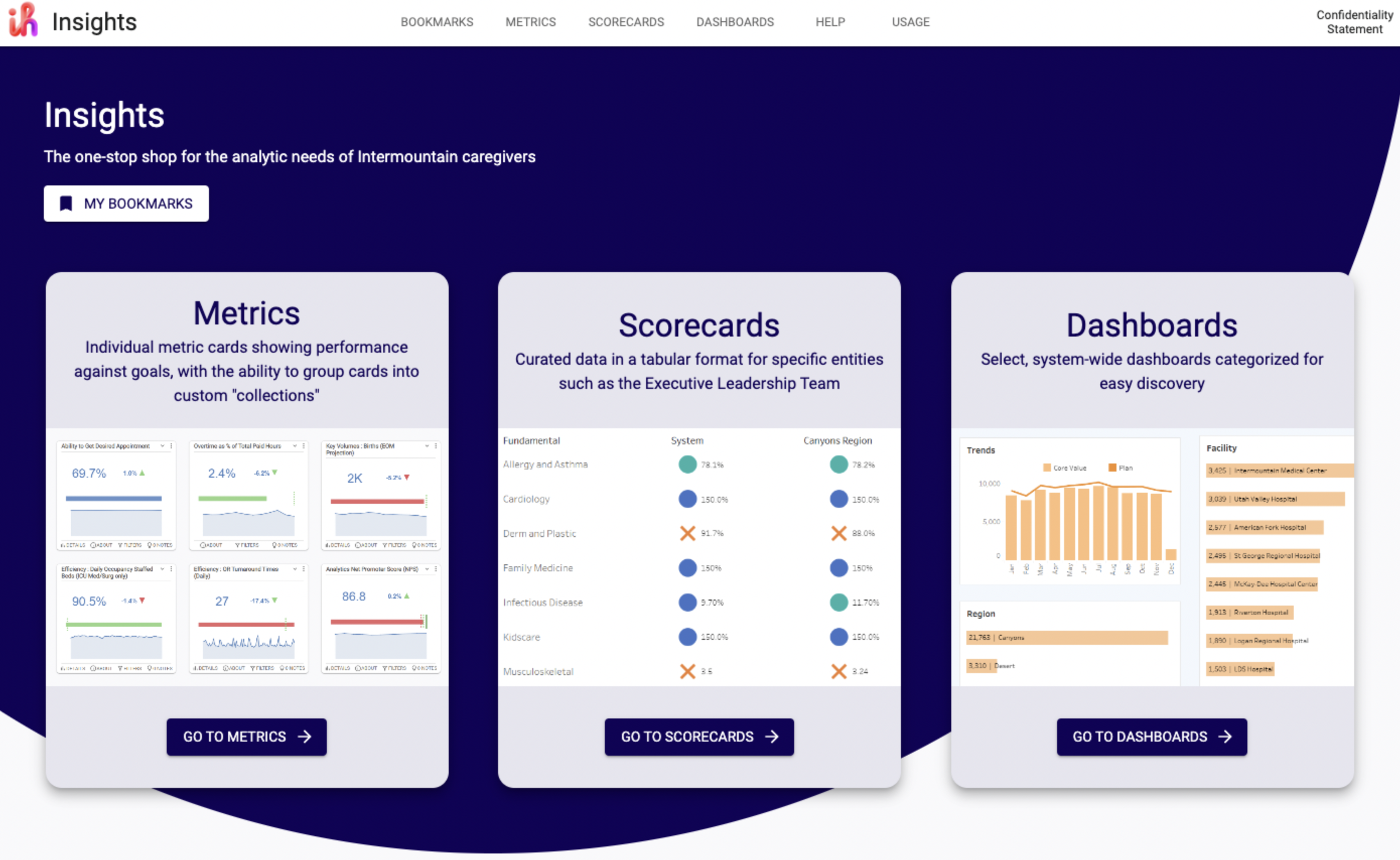
Expanding the Information Architecture
We reorganized content into three categories: metrics, scorecards, and dashboards. This structure made the platform easier to navigate and provided tailored layouts for each category. I worked closely with analysts to audit the existing content, classify metrics, and build out a scalable architecture that could grow with the system.
Redesigning Navigation and Content Grouping
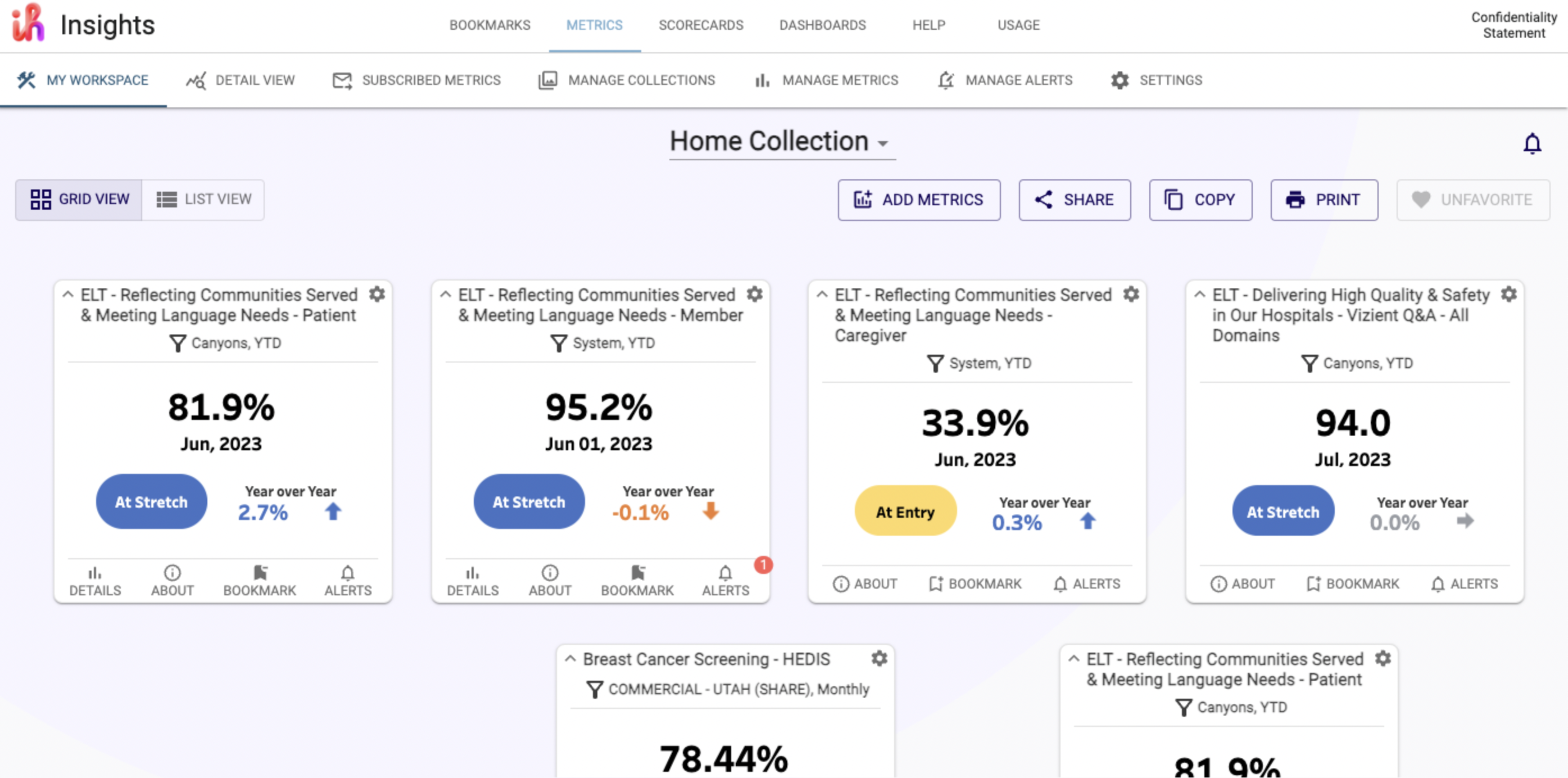
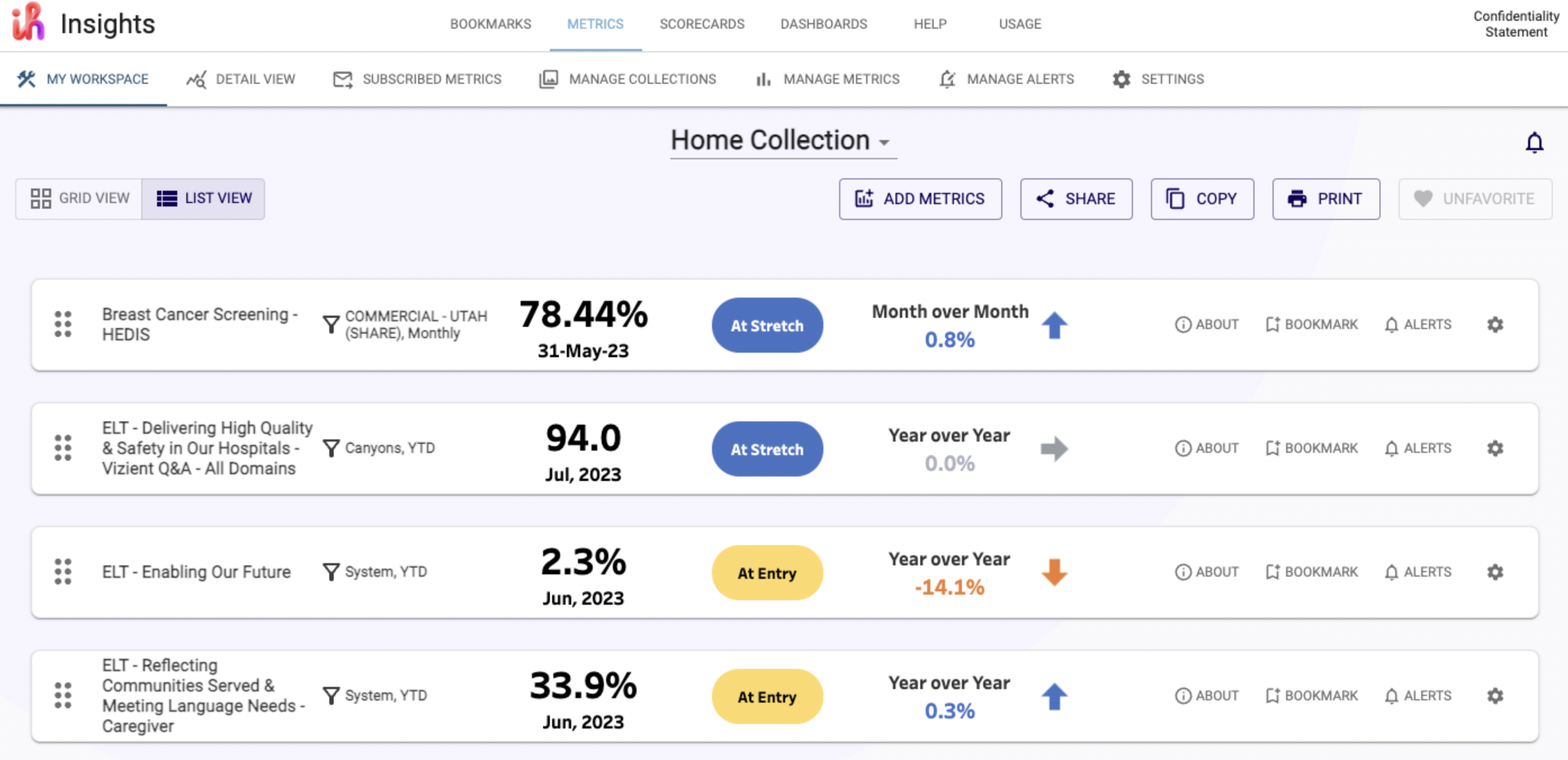
Instead of organizing by department, I created entry points based on metric type. This included new navigation that allowed users to browse all metrics, scorecards, or dashboards with filters by topic, source, and update date.
Supporting Multiple Views: Cards and Lists
Some users preferred a visual overview. Others needed dense, scannable lists. I added a toggle so users could view data in either format. Both views were accessible and supported different working styles.
Designing Scorecards and Dashboards
Scorecards used tiles and trend indicators. Dashboards grouped related metrics for fast comparison. I tested and refined templates to ensure clarity and ease of use.

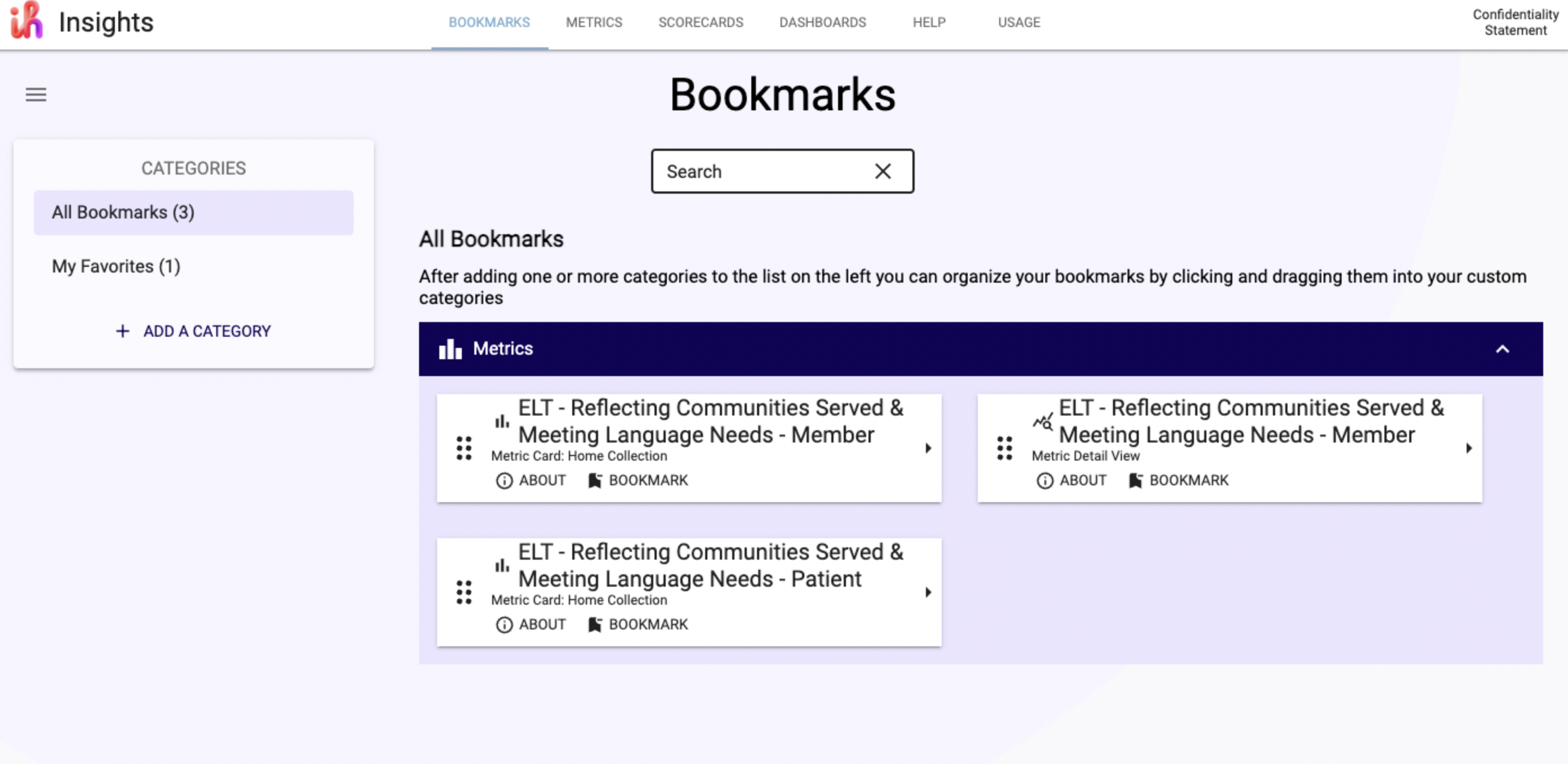
Adding Bookmarking and Personalization
I designed a bookmarking system so users could save and return to the content they needed most. This replaced browser bookmarks and supported platform adoption and return visits.
Process and Collaboration
This project took over a year. We worked as a cross-functional team with weekly sprints, usability tests, and regular design reviews. I delivered new designs every sprint, received feedback, and worked directly with engineers to support implementation. Weekly testing helped us identify issues quickly and build momentum over time.
Outcome
- 50% reduction in user error
- 450% increase in recurring users
- Adoption among executives, physicians, and analysts
- Fewer support requests for Tableau access and dashboard navigation
What I Learned
This project demonstrated that usability is foundational for adoption. Users were not uninterested in data. They simply could not make sense of the system. Fixing this required more than new visuals. It required a structure, process, and collaboration model that supported clear and sustained change.
Working closely with the product manager, analysts, and engineers helped me deliver usable designs while staying aligned with development capacity. Weekly testing allowed us to listen and adapt, and the end result was a platform users could return to and recommend to others.