Redesigning a Grassroots Hospital Discharge Tool into a Scalable Patient Flow Platform
I led the UX design for a care coordination app that evolved from a grassroots Google spreadsheet created by nurse managers into a fully funded enterprise tool. Originally used to track discharge readiness, the early interface reflected a manual, nurse-driven process. I redesigned the system around real-time hospital workflows, introducing a structured list view, streamlined data entry, and screens that highlighted barriers to discharge. Weekly testing helped surface what nurse managers and administrators needed most. The result was a tool that supported hospital-wide communication and saved hours of coordination time each week.
My Role
I was the lead UX researcher and designer for this project. I worked closely with a product manager, data analysts, and engineers to design and test the application. My responsibilities included interviewing nurse managers, mapping workflows, prototyping new interfaces, conducting usability tests, and delivering final UI in coordination with the development team.
Problems We Had to Solve
- The original interface was a shared spreadsheet with inconsistent formatting and no built-in logic
- As the tool was formalized into an app, the design initially prioritized analysts over the actual users—nurse managers
- Nurse managers needed fast, up-to-date discharge summaries for morning meetings but had to sift through too much information
- The system lacked structured data inputs and clear ways to flag or resolve barriers to discharge
Research Insights
At the beginning of the project, I was told this tool was intended for data analysts. The product manager, a former nurse herself, had received the same guidance. But in the first few rounds of usability testing, it became clear this assumption was wrong. The real users were nurse managers who were using a shared spreadsheet during morning huddles to coordinate patient discharge. This insight fundamentally changed the direction of the project.
I conducted weekly research sessions with nurse managers, administrators, and analysts. Observing morning meetings and reviewing how they used the spreadsheet gave me critical insight into the real flow of information and the fast-paced decision-making required. Nurse managers had only about two minutes per patient to review updates and enter new information.
To better understand their needs, I created a nurse manager persona grounded in research observations and interview data. This helped me and the rest of the product team stay focused on the right workflows and pain points. The persona clarified priorities such as speed, visibility into discharge barriers, and the ability to communicate effectively with other departments.
Nurse managers needed to quickly scan all patients on a unit, identify who was ready for discharge, and understand what was holding others up. They also needed to update this information throughout the day with minimal friction. These insights led to a redesign focused on structured summaries, inline editing, and visual status indicators that could support rapid communication during high-pressure, time-constrained workflows.
Design Process
Designing for Real-Time Coordination
At the start of the project, I was told by the product manager that the team needed a direct replica of the existing spreadsheet, along with a detailed form for structured data entry. Based on that direction, I designed an interface that mimicked the spreadsheet layout and paired it with a comprehensive form where all patient details could be entered in a single view.

These early designs helped define the initial scope and allowed the team to begin reviewing real workflows. I used them in early usability tests, which revealed a crucial insight: the primary users were not analysts or care coordinators, but nurse managers.

By observing their morning meetings and asking them to walk through how they discussed patients and updated their records, I began to understand the real process and the urgency they felt in needing fast, high-level summaries of all patients.
Iterative Design Work: Creating a List View for Morning Meetings
Through weekly usability tests and observation of morning meetings, I learned that nurse managers had very limited time to discuss and update patient information. They needed to review every patient on their floor in under an hour. That meant no more than two minutes per patient to both talk about their status and enter updated information. The interface had to support this fast-paced reality.
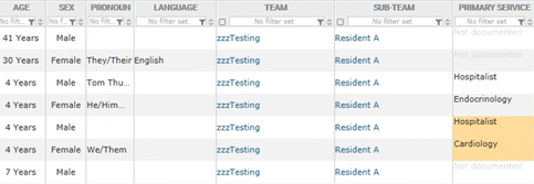
Based on what I learned, I designed a list view that showed all patients on a unit with clear, consistent formatting. Key discharge details were visible at a glance, and icons indicated status or barriers without requiring a click. The layout minimized scrolling and grouped related information together, so nurse managers could work quickly during their meetings. Each row in the list view became a lightweight snapshot of a patient’s status, designed for clarity, speed, and ease of scanning.

Breaking Up Forms for Easier Entry
The original discharge form had been consolidated into a single, overwhelming screen. I broke it up into logical sections with clearer language, allowing nurse managers to update only what was relevant at the moment.

Flagging Barriers to Discharge
In usability tests, nurse managers consistently emphasized the need to quickly identify and act on the barriers preventing a patient from being discharged. They wanted a way to capture and view these details without losing their place in the list view. Based on this feedback, I designed an overlay screen that could be opened from any patient row. This allowed users to view or enter discharge barriers without navigating away.
The overlay included a short, focused form where users could specify what was preventing discharge and assign responsibility to the appropriate team. This made it easy to escalate issues by routing the request to the caregiver or department that needed to act. Nurse managers used this feature during morning meetings to capture next steps and to follow up on outstanding issues later in the day.

Timeline and Collaboration
The design phase of this project lasted six weeks. During that time, I collaborated closely with the product manager, analysts, and engineers in weekly sprints. Each sprint included new design delivery, internal feedback sessions, and usability testing with hospital staff. This approach helped us shape the right structure and workflows before a single line of code was written. Once the designs were validated, the development team began building the tool based on our shared understanding. Because the design work was grounded in real user feedback, it gave the team a clear path forward and reduced the need for major rework during development.
Outcome
- When the patient flow software was made available, nurse managers reported faster discharge coordination and more efficient morning meetings
- Hospital leaders had improved visibility into systemic discharge barriers
- The tool scaled across multiple hospitals after launch, with minimal training required
What I Learned
This project taught me how important it is to understand the informal workflows that keep hospitals running. While the technical implementation was complex, the biggest gains came from listening closely to the people doing the work and building something that reflected their reality.
Designing in the context of live hospital operations required flexibility, strong collaboration, and a focus on incremental wins. The result was not just a more usable interface, but a shift in how discharge coordination happened across the system.