Non-profit website
Sierra Club of Utah Website
The Utah Chapter of the Sierra Club is a grassroots organization striving to:
- Protect and enjoy Utah's outdoors and natural landscapes.
- Educate and advocate for the responsible preservation of clean air, water, and habitats.
- Support the development of clean energy for current and future generations.
- Advance equity, inclusion, and justice throughout the organization and the community.
Executive Summary
I worked with the volunteer-based communications committee to deliver feedback on their mobile site. User testing revealed that the mobile version does not meet the needs of the Sierra Club to effectively communicate current issues, show how to volunteer, or encourage donations. The redesign aimed to bring these key elements forward and make them more accessible for mobile users.


Laura Dahl, PhD, Primary Researcher and Designer
Client's Request for Feedback
The client requested user feedback to guide planned updates for their website. Feedback was essential to ensure the website effectively communicated their goals.
Platform
Volunteer-run website
Work Done
Responsive website with CSS breakpoints (non-Bootstrap)
Timeframe
Two-week sprint in 2021
Overview
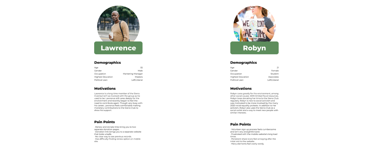
Initial usability testing was conducted with individuals interested in becoming local activists. Feedback from these interviews informed our design decisions, with further testing conducted to refine the final designs.
Exploratory Usability Research
Usability Testing
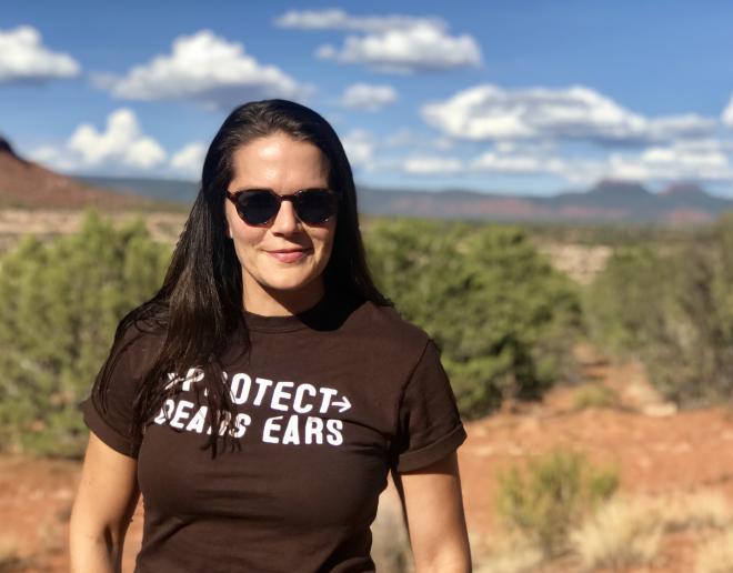
We conducted usability testing with seven participants (three women and four men), who all adopted pets from the Humane Society of Utah. The following scenario tasks were given:
- Learn more about the local Sierra Club and how to participate.
- Find the page that describes the current issues prioritized by the organization.
- Sign up for volunteer work.
- Submit a donation to a favorite cause.
Usability Findings
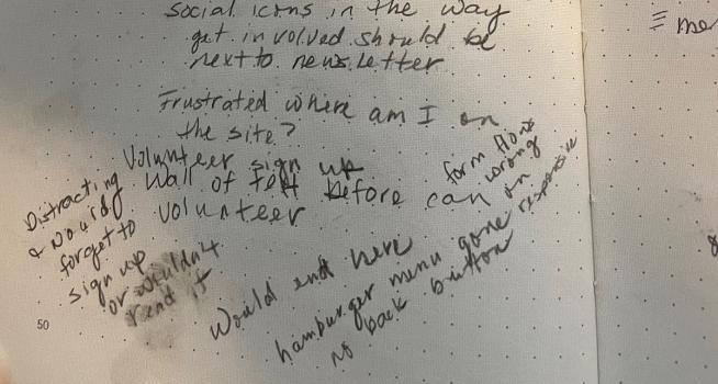
- Participants noted unclear calls to action on several pages, especially on mobile.
- Finding current issues on mobile was cumbersome, with users taking a roundabout path.
- Forms for volunteering and donations were hard to locate, buried at the bottom of the page.
Problem Statement: The Utah chapter of the Sierra Club's website buries and minimizes the key calls to action (communicating current issues, volunteering, and donating), especially on mobile. The site needs to prioritize these elements and make them more prominent for mobile users.
Definition and Ideation
- Analyzed notes and categorized findings on Miro. A one-page research report was delivered to the client.
- Discussed research findings with the client and proposed updates to the content structure and the addition of Bootstrap components for responsive functionality.
- Conducted a competitive analysis of other Sierra Club chapters and non-profit websites to assess how their calls to action were presented.
- Collaboratively sketched user workflows and initial designs for the updated pages.
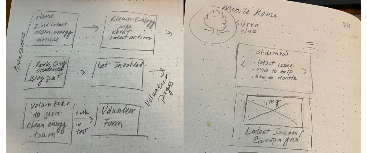
Low-Fidelity Prototype
We created low-fidelity wireframes in Figma, adjusting key pages to meet usability needs:
- Current issues and campaigns made more prominent on high-level pages.
- Calls to action for volunteering and donating moved higher up on the page.
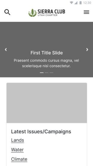
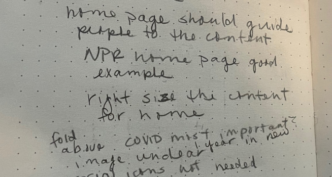
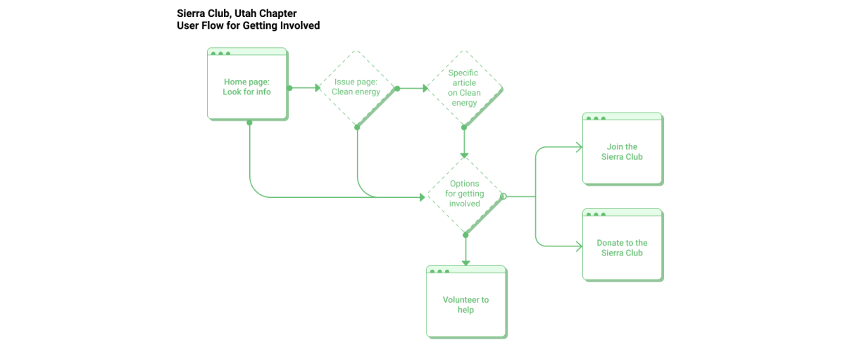
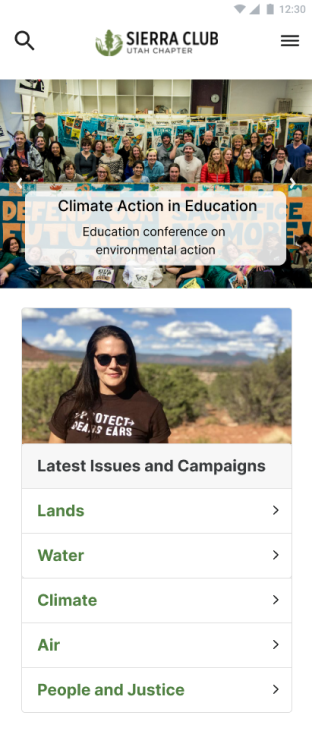
Updated Home Page
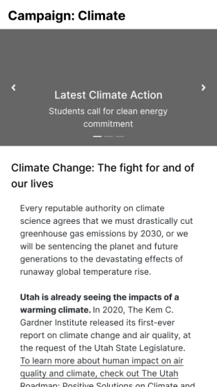
Climate Campaign Page
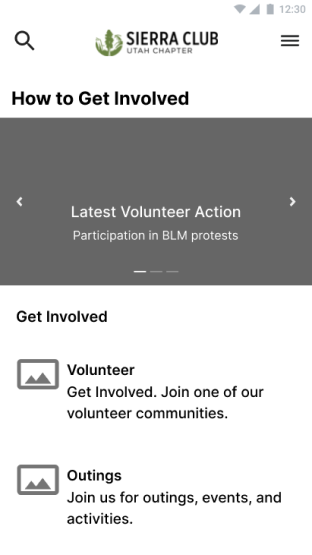
Get Involved Page
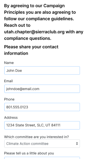
Volunteer Submission Form
Low-Fidelity User Testing & Outcomes
We conducted 30-minute usability tests with the same participants from the first round, using low-fidelity wireframes. Key findings:
- User flow to current issues made sense overall.
- Calls to action for volunteering and donations were not fully clear, requiring adjustments.
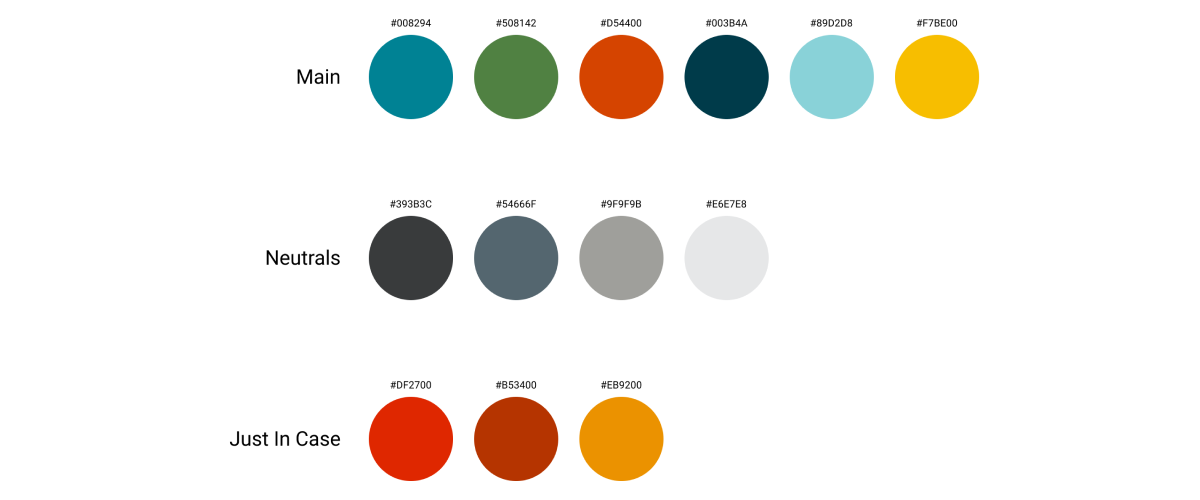
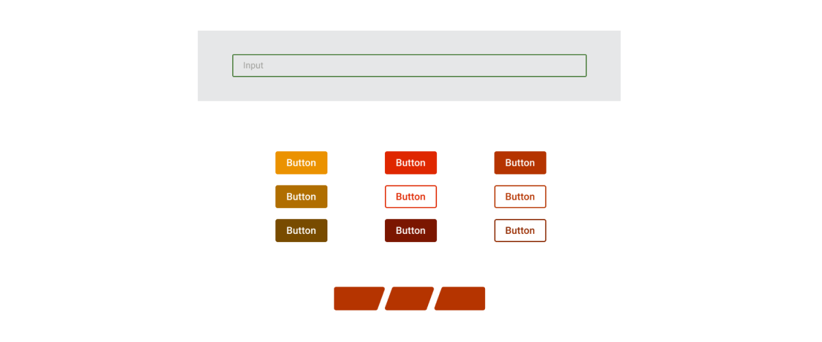
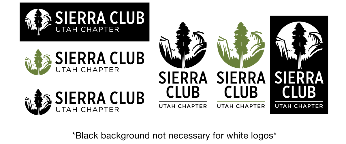
- Client requested updates following the official style guide for colors and logos.
High-Fidelity Prototype
High-fidelity mockups were created based on user feedback, incorporating Bootstrap list components for clearer calls to action.
Updated Home Page
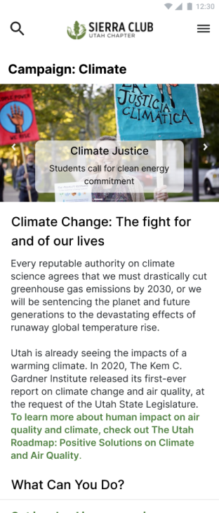
Climate Campaign Page
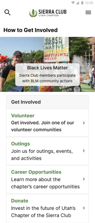
Get Involved Page
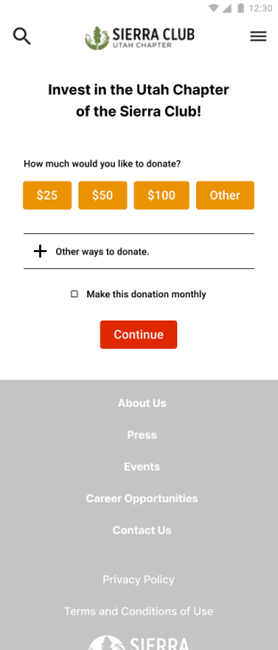
Donation Page
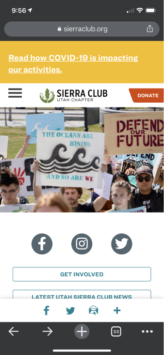
Final Design - Home Screen Before and After
The scope of this project was to update the mobile site for improved communication of current issues, volunteering opportunities, and donation methods. We used Bootstrap 5 components to ensure responsive design.
Old Home Screen
New Home Screen